10 Most Common Trading Patterns Every Trader Should Know and Master

There’s a reason why some traders achieve more success than others: they understand chart patterns. In technical analysis, chart patterns are essential tools that help traders analyse price movements and anticipate future market trends. Recognising these patterns enables informed decisions on entry and exit points.
In this article, we’ll explore the top 10 most common trading patterns that can enhance your strategies.
Key Takeaways
- Traders can forecast future trends and movements by using chart patterns.
- Decisions about entering or leaving trades are guided by reversal and continuation patterns.
- Profitability is increased, and trading techniques are improved by comprehending patterns.
What is a Trading Pattern?
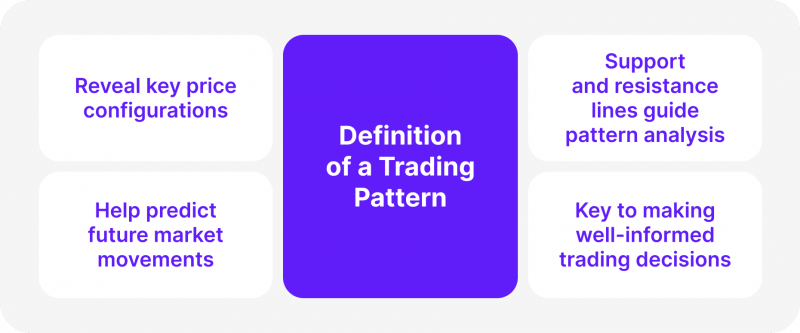
Only 5 to 10 % of traders make profits consistently. The reason behind this consistency might be the ability to read trading patterns. It is a noticeable configuration of price changes in an asset frequently shown on a chart over a given period.
These patterns emerge when price points—like highs, lows, or closing prices—form clear shapes or trends. Traders use these patterns to assess future movements and make well-informed trading decisions.
A key component of technical analysis is chart patterns, which assist traders in spotting profit-making chances by examining behaviour.
Types of Trading Patterns
In general, patterns can be divided into two groups: reversal patterns and continuation patterns. While a reversal pattern implies that the present trend may soon reverse, a continuation pattern indicates that the cost will probably continue in the same direction following a small pause.
Traders can more accurately anticipate future market movements and respond appropriately by comprehending these patterns.
In chart pattern analysis, support and resistance lines are also important components. The resistance line indicates a level that an asset finds it challenging to climb beyond, and the support line indicates a level that an asset often does not fall below. These lines and trend lines are essential in understanding how chart patterns form and signal future movements.
The Importance of Reading Charts in Trading
Reading charts is a vital skill as it enables traders to examine market changes and make well-informed decisions. Trading charts visually represent past data, illustrating the movement of a commodity, stock, or currency over time. Traders can predict possible future movements by analysing these charts and identifying patterns.
Technical analysis, which traders use to predict movements based on historical market activity, depends heavily on stock chart patterns. Recurring price behaviours give rise to patterns like the head and shoulders, wedge, or double bottom patterns, which indicate whether an asset’s price will grow, fall, or move sideways.
Traders can use these patterns to determine when to enter or exit a trade. For instance, a negative reversal pattern like the double top pattern suggests a possible decline. In contrast, a bullish chart pattern like the ascending triangle pattern frequently suggests that the market may continue rising following a temporary consolidation.
The secret to forecasting market moves is identifying trends. Traders can predict whether the cost will break in the same or opposite direction when they recognise patterns like the falling wedge or symmetrical triangle. For example, a triangle chart pattern with two trend lines indicates that, depending on the state of the market, a breakout is likely to occur either up or down.
It’s also critical to comprehend the levels of opposition and support. The resistance line is where prices find it difficult to rise, and the support line is where they typically stop falling. The current trend frequently undergoes substantial fluctuation when a price breaks certain thresholds. These support and resistance levels are used by patterns such as the rising wedge and flag pattern to predict whether the trend will continue or reverse.
Fast Fact
George Soros is well known for his audacious trading tactics and profound influence on the financial industry. He made over $1 billion in a single day from his most well-known trade, “breaking the Bank of England.”
10 Most Common Trading Patterns
Below, we will discuss the most famous and widely known patterns that every trader knows about and has the ability to comprehend.
1. Head and Shoulders
The head and shoulders pattern is one popular reversal chart pattern that indicates a change in the dominant trend. It has three peaks: the head, which is the higher central peak, and the shoulders, which are the lesser peaks on either side. When a horizontal line—the neckline—is created across the two lowest spots between the shoulders, this pattern is finished. A price breach below the neckline frequently indicates a trend reversal from bullish to bearish.
When it comes to accurately forecasting bearish reversal patterns, the head and shoulders pattern is widely respected. This pattern is used by traders to spot possible price declines, mainly when it drops below the neckline with higher volume.
Let’s look at a fictitious stock chart head and shoulders pattern formation example:
A certain stock has been growing gradually for several months, indicating a strong bullish tendency. But a clear pattern begins to emerge in the price action:
Left Shoulder: The left shoulder is formed when the stock price peaks.
Head: The head is produced when it increases to a higher peak.
Right Shoulder: The price then drops and completes the right shoulder by forming a second peak lower than the head.
Neckline: The two lowest points between the shoulders are connected by a horizontal line.
Breakout: The price confirms the pattern and indicates a possible bearish trend reversal when it breaks below the neckline.
Here is how to interpret the scenario: The head and shoulders pattern indicates that the bullish trend is waning. The stock will probably continue to drop since the breach below the neckline shows that the selling pressure outweighs the buying pressure.
2. Double Top and Double Bottom
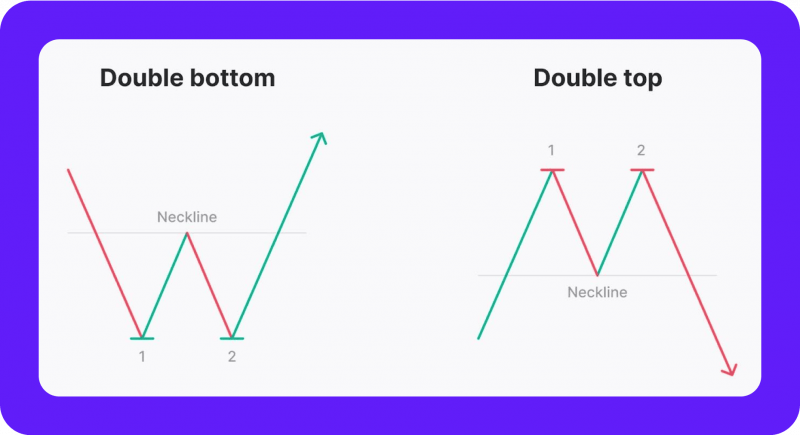
Classic reversal chart patterns include the double top and double bottom patterns. A double top is created when an asset hits a high price point twice, with a small drop in between. The price indicates a possible downward trend if it cannot break the high on the second try. This pattern frequently precedes a negative trend.
The opposite is true for a double-bottom pattern. It develops when an asset experiences two low price points, with a small recovery in between. The beginning of a bullish reversal pattern, which would signify an upward shift in the trend, could be indicated if the price cannot break lower on the second try. Both patterns serve as important predictors of future trend reversals.
Consider a well-known tech stock that has been experiencing an upward trend for several months and the price hits its peak. Following a short decline, the price increases once more but falls short of the prior peak. Rather, it creates a second top that is marginally lower than the first. A possible downward trend may be imminent, as shown by this double-top formation, indicating that the purchasing pressure is decreasing.
Now, think about an alternative situation: Significant declines have occurred in a failing stock. The price reaches a low point (the first bottom). Following a brief uptick, the price drops once more but cannot surpass the prior low. The selling pressure may be waning, and an upward trend may be beginning to emerge, according to this double-bottom pattern.
3. Triangles (Ascending, Descending, Symmetrical)
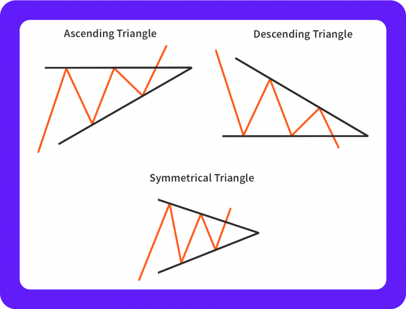
Triangles are popular chart patterns to forecast changes in the market. Triangles come in three primary varieties: symmetrical, descending, and ascending.
A rising trend line at the bottom and a horizontal resistance line at the top combine to form an ascending triangle pattern. Once the price breaks the resistance level, this pattern points to a possible breakout in the same direction as the current bullish trend.
Examining an Uptrend
The price action forms an ascending trend line, making a succession of higher highs and higher lows. Nevertheless, a horizontal resistance level is consistently broken by the price. This forms a triangle, with the horizontal resistance line at the top and the rising trend line at the bottom.
A possible upward trend continuation is indicated when the price eventually breaks above the resistance level. The breakout frequently results in a notable price gain.
A falling trend line at the top and a horizontal support line at the bottom characterise a descending triangle pattern. The price usually indicates a bearish continuation pattern when it breaks below the support line.
Examining a Downtrend
A falling trend line is formed by the price making a string of lower highs and lower lows. The price frequently bounces off this level, forming a horizontal support level. A descending triangular pattern is produced as a result.
The price indicates a negative continuation when it breaks below the support level. This frequently causes the stock price to drop even further.
Two converging trend lines, one sloping upward and the other downward, make up a symmetrical triangle. According to this pattern, the price could break out either way, depending on market forces. Traders see symmetrical triangles as bilateral patterns, suggesting possible breakouts in either direction.
A more neutral pattern is a symmetrical triangle. It develops as the price range gets smaller as the resistance and support levels converge.
The breakout is a difficult pattern to forecast since it can happen in either direction. On the other hand, higher trading volume during the breakout can serve as a reliable predictor of the likely course.
4. Flags and Pennants
Short-term continuation patterns, known as flags and pennants, indicate a brief period of consolidation before the price resumes its previous trend.
When a minor pullback follows a significant price movement, the price moves within two parallel lines that slope against the upward or downward trend, creating a flag pattern. Usually, this pattern results in the initial trend continuing.
Let’s say one of the crypto coins has been seeing significant growth. The price action pauses and consolidates within two parallel trend lines following a big price rise. Let’s take a look at the characteristics:
- Positive Trend: The value of cryptocurrency has been rising gradually.
- Consolidation Phase: The price forms a flag as it slowly retreats but stays within a predetermined range.
- Breakout: The price confirms the uptrend’s continuation by breaking above the flag’s upper trendline.
Similar in appearance, a pennant pattern consists of two trend lines that converge to form a tiny, symmetrical triangle. The price frequently breaks out in the direction of the previous trend after the pennant, confirming the continuation pattern.
In a different case, the price of that cryptocurrency may drop rapidly. Following this initial decline, the price creates a symmetrical triangle by consolidating within two convergent trend lines.
- Declining Trend: The price of the coin has been dropping significantly.
- The phase of consolidation: The pennant is formed when the price settles inside a constricting range.
- Breakout: The price confirms the continuance of the downward trend by breaking below the pennant’s bottom trendline.
Both patterns are helpful for traders who wish to profit from short-term market swings since they show that the market is pausing briefly before resuming its present direction.
5. Cup and Handle
The cup and handle pattern is one of traders’ most common chart patterns. The cup, shaped like a U, is followed by the handle, a smaller downward drift. The handle chart pattern is formed following a minor price decline from the cup’s right side.
The market is anticipated to resume its upward trend following a brief period of consolidation, as this formation usually indicates a bullish continuation pattern. With the possibility of additional price increases once the resistance line is broken, traders view this pattern as an indication that market sentiment is improving.
Let’s imagine a crypto that has been declining. But the price begins to take the shape of a cup, with a U at the bottom. This suggests that the market is finding support at a particular price level and that the selling pressure is decreasing.
A little handle, or a brief period of consolidation or modest drop, is formed as the price rises from the low point. One way to interpret this handle is as a resting place before the subsequent upward movement.
A possible bullish breakthrough is indicated when the price rises above the handle’s resistance level. As the market mentality turns from bearish to positive, this breakout may result in a big price increase.
6. Wedge Patterns (Falling and Rising)

Another crucial trading structure is a wedge pattern. Rising wedge and falling wedge are the two varieties. The price moves lower within two convergent trend lines in a falling wedge formation, with the lower trend line having a greater slope. This pattern frequently indicates a bullish reversal pattern, indicating that once the price breaks through the top trend line, it may reverse and move upward.
Consider a coin that has been experiencing significant growth. But the price creates a wedge shape as it consolidates within two convergent trend lines. Compared to the upper trend line, the lower trend line is steeper. This pattern suggests that a possible downward trend may be imminent and that the buying pressure is waning.
In contrast, a rising wedge pattern is created when the price increases and both trend lines converge, with the higher line sloping steeper than the lower. The price may decline after it breaks below the lower trend line, according to this pattern, which frequently signals a possible bearish reversal pattern. Depending on the market environment, both wedge patterns can be utilised to spot either reversals or continuations.
On the other hand, when a coin is declining, a rising wedge pattern emerges. In this instance, the higher trend line is steeper than the lower trend line, yet the price consolidates inside two convergent trend lines. This pattern implies that a possible upward trend may develop and the selling pressure is lessening.
7. Rounding Bottom
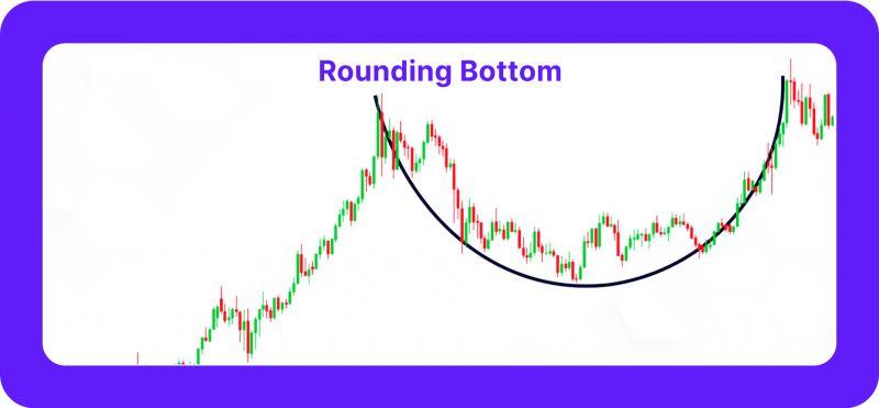
Following a negative trend, the rounding bottom chart pattern is a slow reversal pattern. A gradual change in market sentiment from negative to bullish is indicated by this pattern, which manifests as a rounded, U-shaped bottom.
Traders interpret the price starting to rise from the U-shape’s bottom as an indication of possible upward momentum. This configuration points to a potential bullish trend as buyers are taking control and selling pressure has lessened. It is a crucial pattern for spotting long-term shifts in the direction of prices.
Imagine a cryptocurrency that has been declining for a long time. The price creates a rounded, U-shaped bottom as the selling pressure eases. This suggests that a particular price level is providing support for the market. A possible bullish reversal is indicated by the price beginning to rise from the bottom of the U. The price may rise significantly due to increased buying pressure.
8. Bullish and Bearish Engulfing
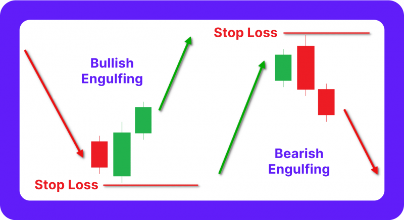
Essential candlestick patterns that signify significant trend reversals are bullish and bearish engulfing formations. A short, bearish candle is followed by a more significant bullish candle that engulfs the preceding one, forming a bullish engulfing pattern. A bullish pattern will probably follow, as this pattern indicates buyers have taken over.
For example, a down-trending coin may develop a bullish engulfing pattern. A big green (bullish) candlestick that engulfs the previous one comes after a small red (bearish) one. Given that purchasers have outpaced sellers, this suggests a significant downward trend reversal.
On the other hand, a bearish engulfing pattern indicates that sellers are controlling the market and that a possible downward trend may ensue when a larger bearish candle surpasses a small bullish candle. Because they consistently show changes in market mood, both patterns are highly valued in candlestick charts.
An uptrending coin can develop a bearish, engulfing pattern. A big red candlestick (bearish) that engulfs the previous one comes after a modest green (bullish) candlestick. The fact that sellers have outpaced purchasers suggests that the upward trend may be about to reverse.
9. Triple Top and Triple Bottom
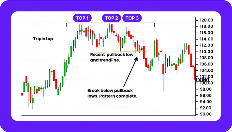
Although there is an extra peak or trough, triple top and triple bottom patterns are similar to double top and double bottom patterns. A triple top occurs when the price hits a high point three times but cannot overcome the resistance level each time, a sign that the purchasing pressure has lessened. This pattern suggests a trend reversal may be on the horizon as the current trend approaches exhaustion.
A triple bottom, on the other hand, happens when the price falls three times without breaching the support level. Like the triple top, this pattern indicates that sellers are weakening, and a positive reversal could ensue. Due to the extra retest of support or resistance, triple tops and bottoms are more accurate markers of trend exhaustion than double tops and bottoms.
10. Rectangle Patterns
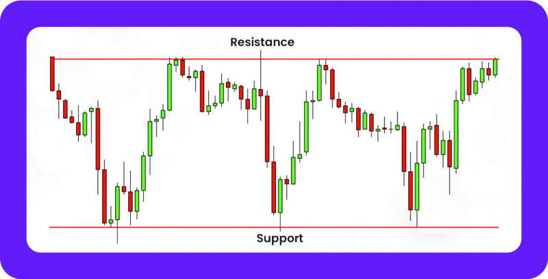
When the price spends a lot of time moving between parallel support and resistance lines, a rectangle pattern forms a horizontal consolidation zone. The market currently needs to be more clear, with buyers and sellers fighting to control the current trend. The price usually moves toward the breakout after it leaves this region.
Traders use this pattern to predict possible breakouts and adjust their positions accordingly. A bullish continuation is indicated if the price breaks above the resistance level; a bearish move is suggested if the price breaks below the support level. After periods of consolidation, rectangle patterns help predict future breakouts and determine the market’s direction.
Final Thoughts
To make wise selections, traders must become proficient in these typical trading patterns. By recognising chart patterns, you can predict market movements and spot possible entry or exit opportunities. Your ability to comfortably navigate various market conditions is strengthened by consistent experience reading charts and seeing trends. By making well-considered decisions based on trustworthy data, consistent pattern recognition helps you stay ahead of the competition in trading.
FAQ
What distinguishes continuation patterns from reversal patterns?
While continuation patterns suggest the current trend will continue, reversal patterns indicate a change.
Which trading patterns are the most common?
Traders are comfortable with the head and shoulders and triangle patterns. They are common and provide a starting point for more in-depth chart examination.
What distinguishes bullish trading from bearish trading?
A bull market is one in which prices are rising and traders are feeling optimistic. A bear market indicates a more gloomy outlook as prices are declining.


